

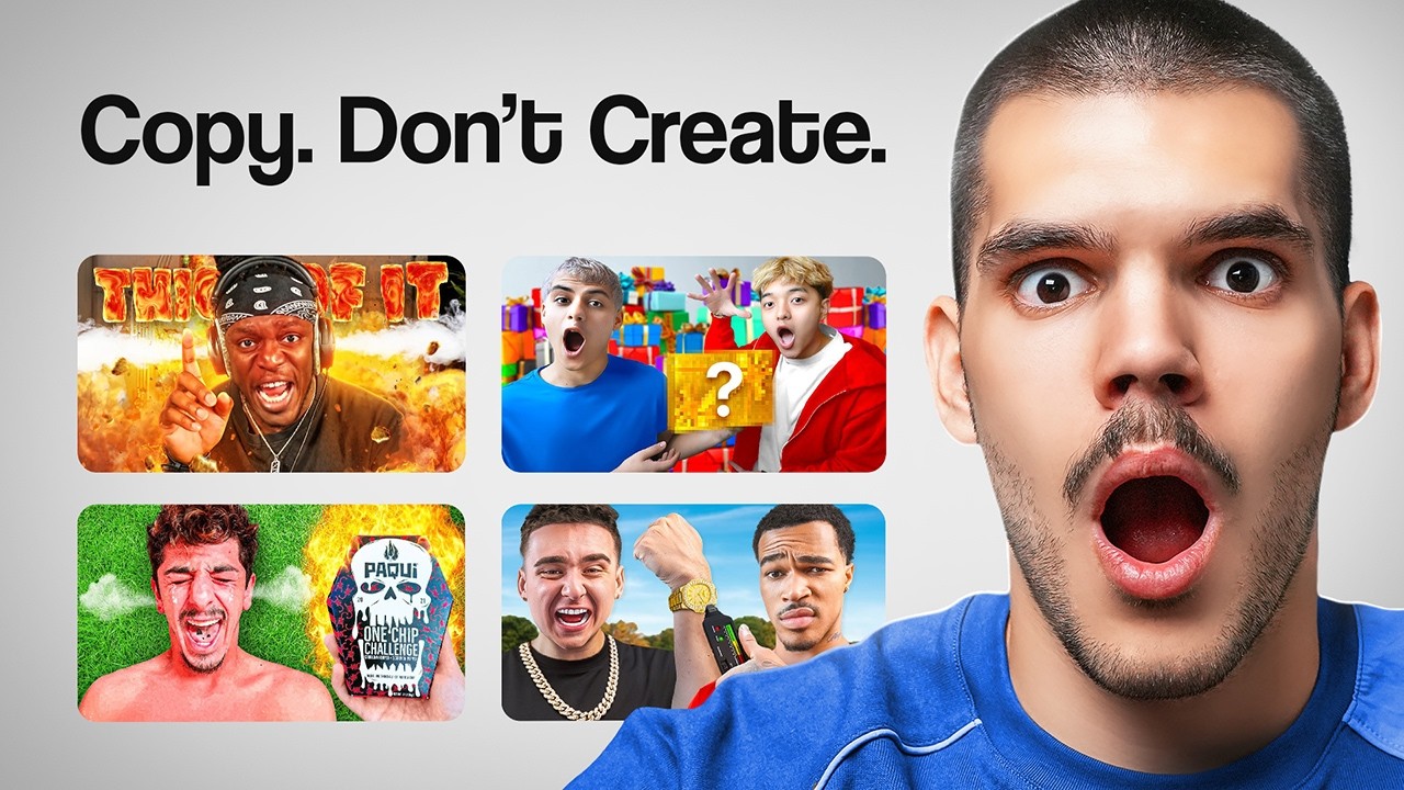
The most common YouTube thumbnail mistakes are skipping competitor research, cluttering the frame, underinvesting in design, never testing, going too dark, ignoring proven styles, and using clickbait. Fix those seven and your click rate climbs.
Here is the hard part. If people do not click, they do not watch. And if they do not watch, they never buy. Your thumbnail is the gate in front of every view, every subscriber, and every client. Most advice tells you to pull a crazy face and slap on a bold title. That is not it. Below are seven mistakes that quietly cost you views and money, plus one psychology move at the end that changes how you think about thumbnails for good.
Mistake 1: You skip competitor research
Before you design anything, search your topic on YouTube and study the thumbnails that already work. Most people never even type their idea into the search box. That is a wasted head start.
Someone has already tested thumbnails on your topic. Build on what works instead of guessing from zero. Say your video is "5 best investing tips in 2025." Search that phrase. Look at the top results and break down what they do. Do they use a face? Text? Props in their hands? Steps like step 1, step 2, step 3?
Then take the pieces that work and make them yours. Write a sharper title. Shoot a different face. Rearrange the steps. Change the design. Keep what converts and add your own angle. The same habit works for the idea itself: study your competitors' outliers and rebuild them better. Making a thumbnail without research is like trying to solve a hard math problem when you never learned division.
Mistake 2: You put too much on the thumbnail
Give the viewer one thing to look at. The fastest way to kill a thumbnail is to crowd it. Too many elements and the eye has nowhere to land.
Clients always want to pile it on. The podcast guest's name. A logo. A line of text. The guest's country flag. That is too much. Every thumbnail needs a hero: the one main element that grabs attention first. It can be a face, an icon, or a few words. Pick the most important thing and make it strong, because that is what the viewer sees first and what decides if they watch.
You steer attention with simple tools. White space. Leading lines. A clear foreground. An arrow or a circle to point at something. A spotlight. The size of each element. This is just photography and design applied to a tiny canvas. When everything fights for attention, the viewer feels lost and scrolls past.
Mistake 3: You underinvest in design
Spend real money on your thumbnail, because it is the single biggest factor in whether your video gets views. A five dollar thumbnail looks like a five dollar thumbnail.
Here is the logic. If they do not click, they do not watch. If they do not watch, they do not buy. So when you are deciding whether to spend more or less on a designer, spend more. You can find strong thumbnail designers on Upwork, Fiverr, Twitter, and creator communities. Expect to pay around 25 to 50 dollars per thumbnail. For the one asset that controls your view count, that is cheap.
Mistake 4: You do not test your thumbnails
Test your thumbnails, because guessing leaves data on the table. YouTube added built-in thumbnail testing around June 2024. It runs up to three thumbnails and keeps the one with the best click-through rate and average view duration.
There are two ways to test. The first is three completely different concepts: three separate ideas and designs. The second is one concept with small changes, like swapping a smiling face for a flat one, changing the headline, or changing an icon. The three-different-concepts approach fits bigger channels, roughly 10,000 subscribers and up. Either way, testing teaches you what your audience actually reacts to, and that knowledge compounds over time.
Mistake 5: You make your thumbnails dark
Keep thumbnails bright, sometimes brighter than feels natural. Dark, moody photos look great on Instagram. On YouTube they disappear. Most people watch on a phone, where a thumbnail is tiny. A bright, high-contrast image pops out and pulls the eye. A dark one blends into the app and gets skipped.
Try this on your next upload. Make three versions: one extra bright, one in the middle, one dark. The bright or the middle one will win. The dark one will lose. Run it yourself and watch what happens.
Mistake 6: You ignore proven thumbnail styles
Build a library of thumbnail styles for the kinds of videos you make, so you never start from a blank page. After producing around 15 videos a week for clients, clear patterns show up. Most videos fall into buckets: transformation videos, explainer videos, how-to videos, step-by-step videos, podcasts, and vlogs.
Each bucket has thumbnail styles that tend to work. Save them. Keep one document with your best styles for each type of video. When a new video fits a bucket, open the document, pick a style, and customize from there. It speeds everything up, especially if you post several videos a week. Notion, Google Docs, anything works. The point is to stop designing every thumbnail from scratch.
Mistake 7: You rely on clickbait
Make an honest thumbnail, because clickbait backfires fast. Your title and thumbnail together are the packaging of your video. The first job of any video is to confirm that the viewer will get what they clicked for.
Slightly clickbaity does not get a pass. You are not legacy media inventing wild headlines. You are competing for attention with thousands of other creators, and the only way to win it is to deliver what you promised. YouTube viewers are brutal. They will not give you their watch time if the video does not match the thumbnail, and a let-down video tanks.
So in the first few seconds, confirm the promise out loud. Something as plain as "in this video we are going over seven deadly thumbnail mistakes" works. It is honest, and it tells people they are in the right place.
The 7 YouTube thumbnail mistakes at a glance
Here are the seven YouTube thumbnail mistakes again, so you can audit your last upload in under a minute:
- No competitor research before you design.
- Too many elements and no clear focal point.
- Underinvesting in the design.
- Never testing different versions.
- Dark images that vanish on a phone.
- No saved styles for your video types.
- Clickbait that breaks the promise.
The bonus move: cognitive dissonance
The simplest way to earn a click is cognitive dissonance: show the viewer a belief that clashes with what they already think, and their brain has to resolve it. When two ideas conflict, the mind wants to settle the conflict right away.
Here is an example. You have been told your whole life to sleep eight hours. It is the standard. Then a thumbnail says you do not need eight hours of sleep. Part of you thinks the experts disagree, but you are already clicking, because you need to close that gap. Before you know it, you are twenty minutes into the video.
So ask one question about your topic: what does almost everyone believe that is not actually true, and can I challenge it? Put that tension in your title and thumbnail. It is exactly what happened at the top of this page. The common belief is that great content has to be original. The sharper truth is that you should copy what already works first, then make it yours. That tension is the click. For more on this move, see how to make your YouTube thumbnails stand out with a contrarian take.